
What you’ll learn
You will learn how to choose among the four Full Page and four Product Page templates, customize the supported brand controls in the central Design workspace, and revise customer-facing language without changing the bundle’s commerce rules. You will also test the states that expose real design problems: selection, validation, savings, sold-out products, and long summaries.
Design should clarify the bundle journey. It should not conceal required choices, replace accurate pricing, or make the bundle feel disconnected from the active Shopify theme.
Before you begin
Collect the storefront’s primary text, background, accent, border, and button colors. Note the theme’s heading and body typography. Prepare actual product titles and images, including unusually long names and mixed image ratios. A clean mock assortment is not enough to judge production behavior.
Decide which controls your current Only Bundles plan includes. The Free plan keeps a useful core design set, including brand colors and typography, while advanced design controls and the full template library belong to Growth. If a store later moves to Free, the remediation should be explicit; core bundle data and selling features should not be treated as disposable design settings.
1. Choose a template by shopping task
For Full Page Bundles, review Standard, Classic, Compact, and Horizontal. For Product Page Bundles, review Product List, Product Grid, Horizontal Slots, and Vertical Slots.
Use Standard or Classic when customers benefit from a clear guided rhythm. Compact can help a denser assortment, while Horizontal suits journeys where wide cards and progressive movement fit the catalog. On product pages, List favors readable details, Grid supports visual browsing, and slot layouts emphasize filling a defined set.
Do not choose from the empty preview alone. Add representative products and complete a valid selection before deciding.
2. Open the central Design workspace
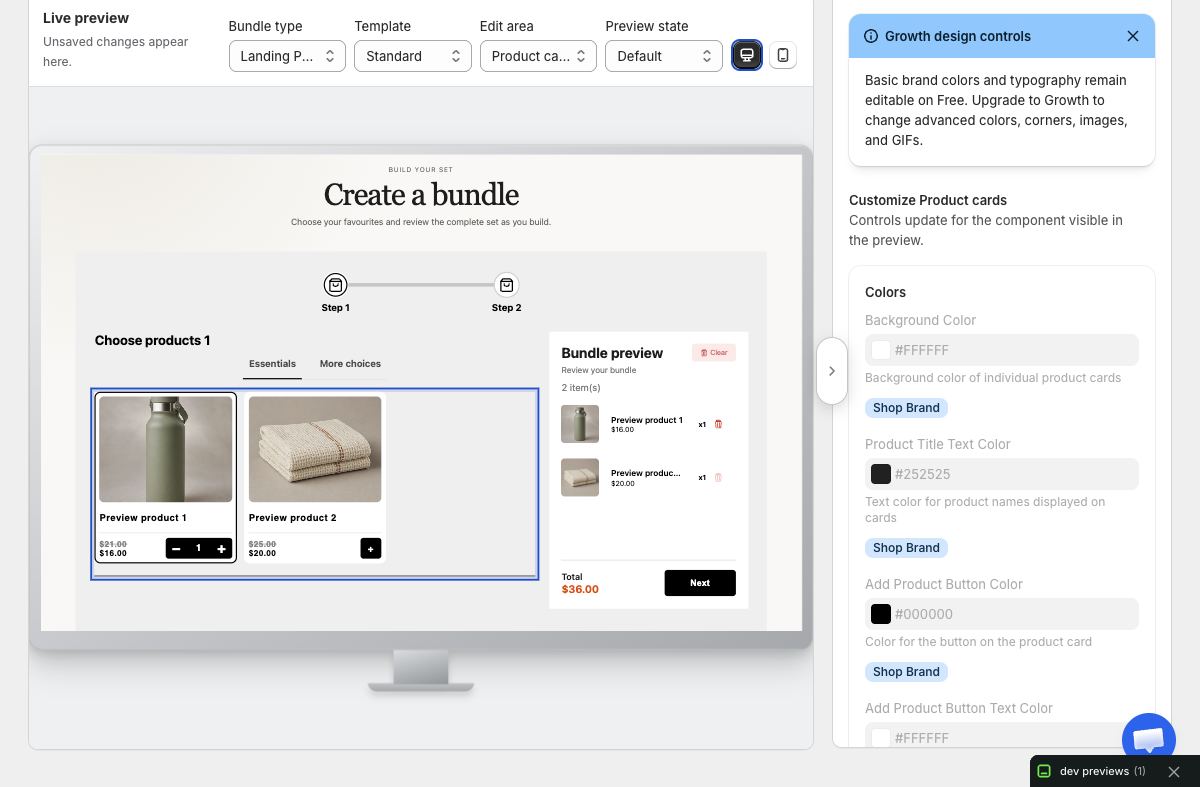
From Settings, open Design. Choose the bundle surface you want to edit—Landing/Full Page or Product Page—then select the relevant template. The preview-first workspace lets you inspect the experience while changing supported controls.
Work from broad to specific:
- Establish the page or container background.
- Set text and muted text contrast.
- Set the main accent and primary action treatment.
- Review borders, card surfaces, and selection indicators.
- Adjust typography and available advanced details.
Save coherent groups rather than changing every control before checking the preview.
3. Preserve readable contrast and hierarchy
The primary action, selected product, current step, progress, validation message, and disabled state must remain distinguishable. An accent that works on a large button may fail as small text. A subtle border may disappear against product imagery.
Use the theme’s visual vocabulary without copying every theme decoration into the bundle. The builder needs a stable internal hierarchy across different themes. When in doubt, prioritize readable labels and obvious selection feedback over decorative similarity.
4. Test preview states intentionally
Use the available preview state controls to inspect more than the starting screen. At minimum, review:
- Empty and partially selected states.
- A completed selection with a long summary.
- A product with several variants.
- Disabled or sold-out choices.
- Validation or quantity guidance.
- An active discount tier and progress message.
- A gift, add-on, or subscription choice if enabled.
Changes that look balanced when empty can become crowded after prices, badges, and quantity controls appear. Preview content should be representative of the real catalog.
5. Customize language around customer decisions
Open Settings → Language for global supported text, and use bundle-specific text controls where the editor provides them. Write short labels that describe actions: “Choose two,” “Review your box,” or “Add bundle to cart.” Avoid internal terms such as “step configuration” or “offer object.”
Keep the same concept named consistently across instruction, progress, summary, and action text. If the bundle calls selections “items” at the top, do not suddenly call them “components” in an error message.
Translations should preserve the rule, not just the tone. Ask a fluent reviewer to check quantities, plurals, discount claims, and button meaning. Custom copy and translations are selling capabilities, not a reason to hide core bundle behavior behind a paid design tier.
6. Review both bundle surfaces independently
Design settings are not proof that every template and surface behaves identically. Full Page Bundles have step navigation and a dedicated summary relationship. Product Page Bundles must coexist with the theme’s product media and buying form.
If the store uses both surfaces, test each with its actual template. A typography scale that suits a dedicated landing journey can be too large inside a narrow product-page column.
7. Verify the live theme on desktop
Save the intended design, sync or publish as required by the normal bundle workflow, and open the storefront with cache bypassed. At desktop width, verify initial, selected, error, and completed states. Check that the bundle appears visually connected to the theme while retaining clear internal controls.
Inspect real content overflow. Long product names should wrap without covering prices or controls. Mixed image proportions should remain understandable. Focus indicators must stay visible for keyboard users.
8. Verify a genuinely resized mobile window
Resize the browser window to about 390 by 844 and reload. Do not use browser zoom as a substitute. Navigate every step, open selectors, change quantities, trigger validation, review the complete summary, and reach the cart action.
Check that sticky trays do not cover content, buttons remain reachable, and text does not shrink until it becomes difficult to read. Responsive design should reflow around content, not merely compress a desktop arrangement.
Troubleshooting
A saved design does not appear live. Confirm you edited the correct bundle surface and template. Refresh the storefront without cache and verify the current storefront asset before assuming the save failed.
Text is unreadable on one state. Identify the exact state and surface color, then adjust the responsible design control. Do not solve contrast by hiding the label.
A control is unavailable. Check the current plan and whether the selected template exposes that control. Use the supported core design options or move to Growth when the advanced design need is genuine.
Translated text breaks the layout. Shorten only if the meaning remains exact. Test the full translated phrase on mobile, especially quantity rules and discount progress.
The product page looks crowded. Try a more compact Product Page template and reduce nonessential copy. Keep required variants, pricing, progress, and the main action visible.
Design review checklist
The final design should pass with actual catalog content, every important state, the intended Shopify theme, and both desktop and mobile windows. A polished first frame is useful; an understandable complete journey is the real standard.